
.svg)
.svg)
.svg)
.svg)
.svg)
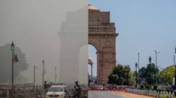
Air quality and health are intricately linked. Understanding the real-time status of urban and industrial air quality – and communicating this well – is important for ambient air quality control.
Air quality visualization – the graphical display of data – helps us understand the distribution of air pollutants in the atmosphere. This is hard to do just by looking at a modern air monitor equipment with its digital display.
By combining real-time monitoring data with python programming, one can easily visualize air monitoring data. Interactive graphs can be created which makes it easier to check air quality, and increasingly diverse colors can visually highlight the air quality level. Visualization of data has a resilient expression (more images and more insightful) than the original data table, which is favorable for further analysis of data.
In this article, I will share examples of data visualization that have helped Devic Earth to convey more clearly the message on air quality.
Heatmaps
The first example is a heatmap – a plot comparing the data of particulate matter levels (PM2.5) during, the last week of March in 2019 and 2020 - Also here is the judgment of cities with best air quality in india during this period. The purpose of the visualization shown here is to compare the air quality during the lockdown with the same time period in the previous year.
Particulate matter less than 2.5 microns. This pollutant causes cardio-respiratory diseases and is emitted by vehicular pollution and combustion activities
In this graph of air pollution, I have plotted PM2.5 levels in 5 cities during March 22-31 2019 and 2020 using python programming and plotly package.
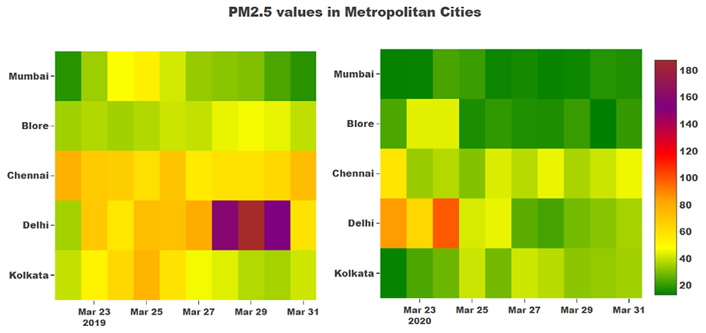
Figure 1. Heatmap of PM2.5 values during the last week of March in 2019 and 2020 across 5 metropolitan cities. Data source: CPCB monitors
Observation:
In Figure 1, the legend on the right side indicates safe levels of PM2.5 through the color-coding – green indicating safe levels, and purple and brown indicating unsafe levels.
At first glance, the graph of air pollution makes it clear that PM2.5 in 2019 was higher than PM2.5 in 2020 in those 5 cities for the same week in March. For example, the 2019 graph shows PM2.5 levels in Delhi are consistently above 60 µg/m3 and even crosses 160 µg/m3 for a few days, whereas in 2020, the PM2.5 levels have been in the safe zone for most of the days. The CPCB ambient air quality standard in India for 24-hour average PM2.5 is less than 60 µg/m3.
What did I do:
Getting CPCB air quality data for each city for the year 2019 and 2020: CPCB air quality data is easily downloaded from the CPCB website (https://app.cpcbccr.com/ccr/#/caaqm-dashboard-all/caaqm-landing)
Data cleaning and processing it into data frames: Here the missing values and outliers are deleted from the dataset and the date & time values which are in one column are separated into 2 different columns
Creating two subplots and combining them into a single plot in the figures: Two subplots are created for each year setting the x-axis to dates, y-axis to cities, and z-axis i.e. the color to PM2.5 values.
Setting up the layout: This involves setting the color scale to that of Air Quality Index, formatting the text for both the axis in each plot to make it readable in the layouts
Plotting the figures along with the layout: Taking the combined subplots and setting it to the layout created in Step 4, plot the entire graph to get the above visual.
Scatter plot
This is the second graph of air pollution where I have plotted PM2.5 reduction levels against the number of days that Pure Skies has been installed at different industry sectors. Using NumPy, I defined a function to calculate the trend line using OLSM (Ordinary Least Square Method) to show the trend of PM2.5 reductions over time.
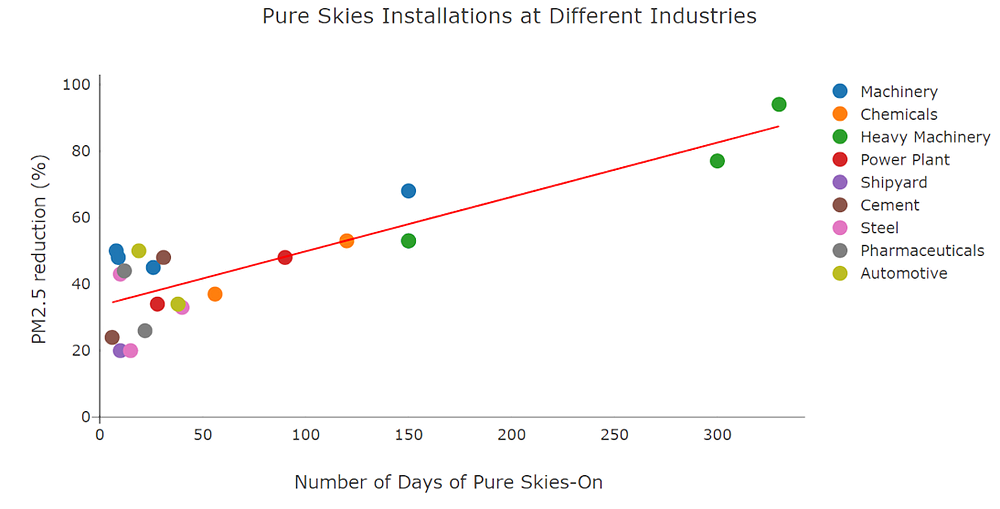
Observation:
PM2.5 reductions improve over time, especially in the heavy machine industries where the baseline graph of air pollution is higher. The trend line which shows a steady increase also indicates the same. The trend line indicates the PM2.5 reductions of 40-60% in the first 150 days. After that, there is an 80% reduction in PM2.5.
What did I do:
-
Divide the dataset based on the type of industries.
-
Define a function to calculate the trendline (y = mx + c, where m is the slope and c is the intercept) using Ordinary Least Square Methods (source:https://docs.scipy.org/doc/numpy/reference/generated/numpy.linalg.lstsq.html)
-
For the plot, using each divided dataset as a separate trace for scatter plot, with the x-axis being the number of days and the y-axis being the PM2.5 reduction, combine all the traces as one array for the figure.
-
Set the format for the axis and texts in the layout to make it readable.
-
Run the function created in step 2 giving the values of x and y in the graph, then add a trace for line plot keeping the x-axis the same and y as m*x + c.
-
Plot the entire figure with the layout.
“A picture speaks a thousand words”
Data visualizations make big and small data simpler for the human brain to comprehend. Visualization also makes it easier to identify patterns, trends, and outliers in sets of data. Good data visualizations should place meaning into complex datasets so that their significance is well-defined and brief.
In terms of business, data visualization speeds up the process of decision making and analytics where instead of calculating for trends or patterns one can easily see it on a graph, saving a measurable amount of time. Since visualization is something everyone can understand it enhances communication across departments in the business, thus making it more efficient.
In terms of air quality – which often cannot be seen – data visualization eliminates that disadvantage, hence displaying the quality of air a person is breathing. It even displays the efficacy of air control equipment, which will help businesses when it comes to investing in air control equipment.
Looking for a Devic Earth recommended and internally used Indoor Air Quality Monitor?

Check this out and book a free consultation with us!
(This article is written by Vidhya Sreenivasan with updates from Shashank Aggarwal)
Articles you might like:
.webp?width=1080&height=1080&name=Free%20Case%20Study%20Steel%20Plant%20(1).webp)


Post Comments